-
KEA BUILDER
Build Funnel & WebsiteKeabuilder
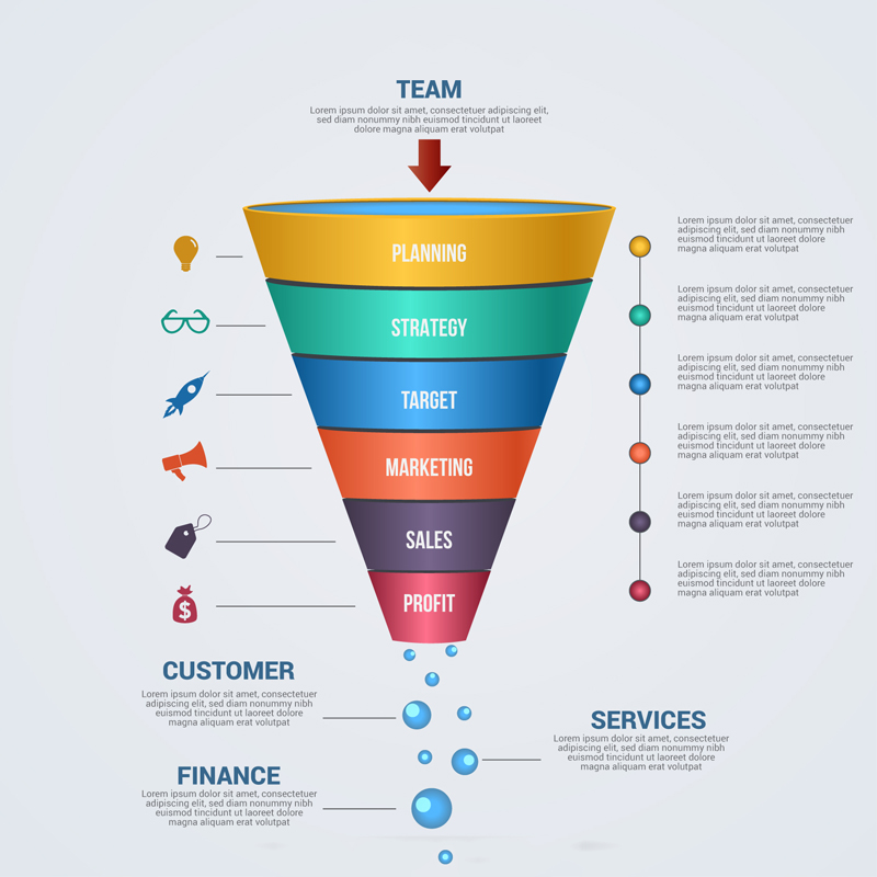
FUNNEL BUILDER
Build Funnel & Variation in a matter of hours without single knowledge of coding or strategic skills.
WEBSITE BUILDER
Build a impressive one page site or a multistep site with a blend of virtual office and blogging enriched with SEO and analytics.
-
Features
Build Shop & CoursesFeatures
Memberships
Effortlessly create and manage subscription-based content with Kea's all-in-one Memberships feature.
CRM
Streamline relationships with Kea's CRM, featuring automation, insights, and personalized engagement.
Sales
Boost revenue with Kea’s Sales tools for efficient tracking, lead management, and deal closing.
Communication
Enhance engagement with Kea's Communication tools for seamless email, chat, and more.
Scrumboard
Efficiently manage projects with Kea's intuitive Scrumboard, enhancing task tracking and team productivity.
Advance Analytics
Unlock business insights with Kea's Advanced Analytics for real-time data and actionable metrics.
Domain
With Kea's easy domain setup and control, manage your online presence.
Project Management
Streamline your workflow with Kea's efficient Project Management tools.
-
Market Place
Hire The Best TalentMarket Place
Automation
Find top experts to automate tasks and enhance productivity.
Digital Marketing
Boost your online presence with our experts, for your growth and engagement.
Virtual Assistance
Get smart support for your tasks with our Virtual Assistance.
Kea Certified Experts
Get expert guidance from Kea Certified Experts for guaranteed success.
-
Resources
360 Degree SupportResources
Help docs and videos
Explore Help Docs and Videos to navigate Kea’s features and optimize your use.
Blogs
Stay updated with our industry Blogs for valuable insights and trends.
Kea support
Get expert assistance with Kea Support for all your platform-related queries and issues.
-
Pricing
Get Started with $1Pricing
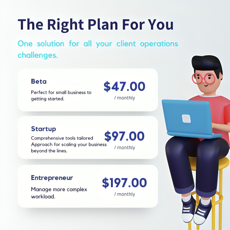
Beta
Perfect for small business to getting started.
Startup
Comprehensive tools tailored Approach for scaling your business beyond the lines.
Entrepreneur
Manage more complex workload.
-
News & Events
Upcoming Information -
Sign Up

